
Order Summary Optimization on Checkout

Role
Product Designer, leading the design iteration and testing
Time
4 weeks |
July 2023
Methods
Competitive Analysis
Data Analytics
Research Insights
Prototyping
Visual Design
Usability Testing
Tools
Figma
Usertesting.com
Airtable
Team
Product Designer, Design Lead, PM
OVERVIEW

Problem
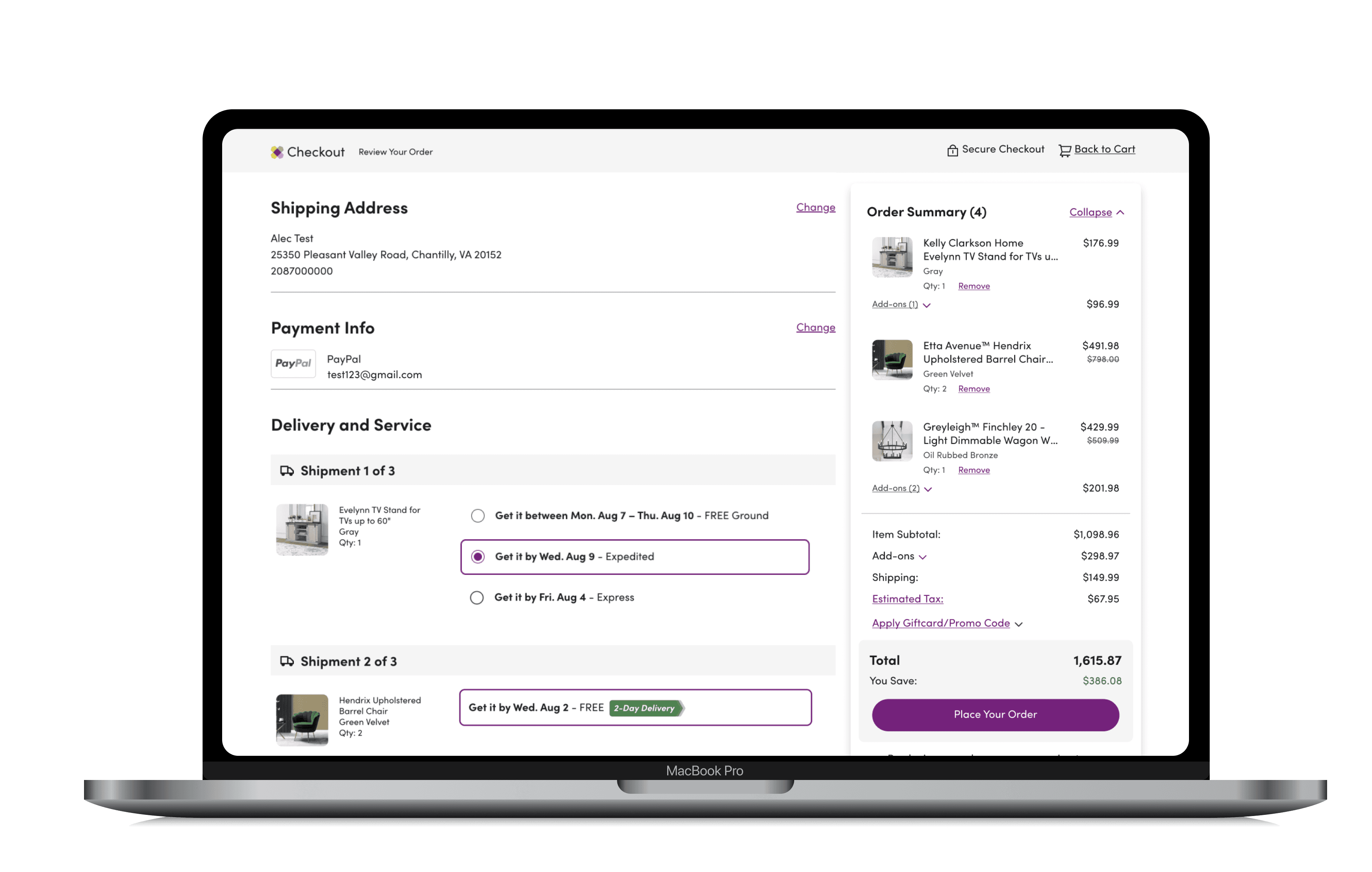
The order summary on the checkout page is plagued by usability issues leading to confusion and cart abandonment, resulting in lower conversion rates.

Solution
A clearer and more concise summary that offers essential information upfront while minimizing distractions during the purchasing experience.

Outcome
75%
user satisfaction
2-3x
smoother checkout process
The redesign was validated and preferred by 8 out of 9 users. I recommended further iterations based on insights and provided next steps to our team director, earning their approval for implementation.
At the end of my internship, I was offered a return full-time role as a Product Designer 🥳
⚡️ Design Preview
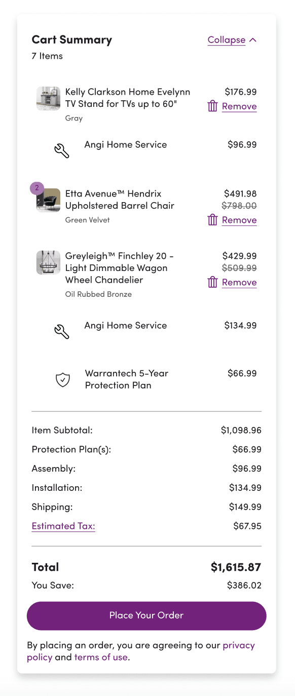
EXISTING
PROPOSED
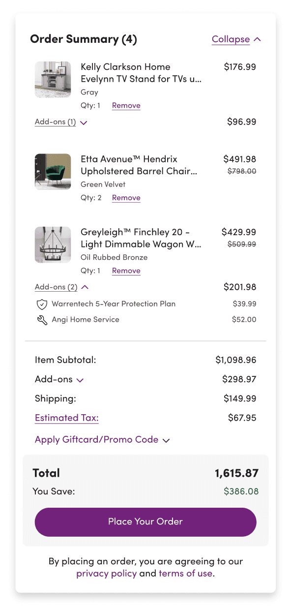
Title and Item Total
Product Card UI + Quantity
Service Add-ons cost grouping
Highlighting total cost & savings
Services under parent product
SETTING THE SCENE
What is an
Order Summary?
It enables customers to check for accuracy and verify that all information is correct prior to order submission.
Where does it fit in?
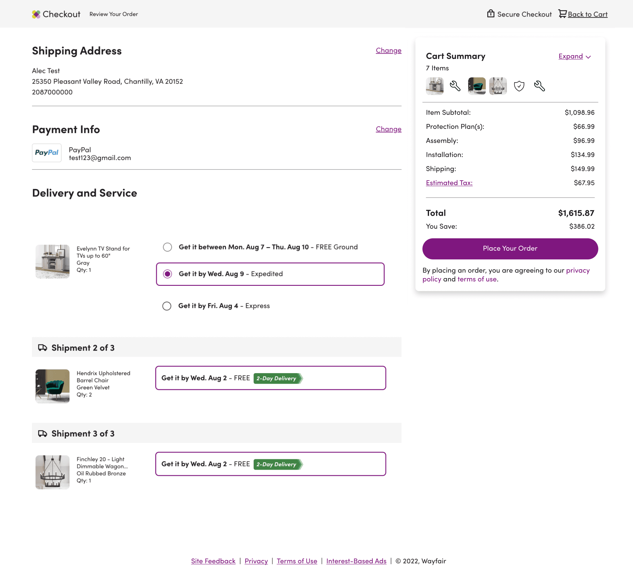
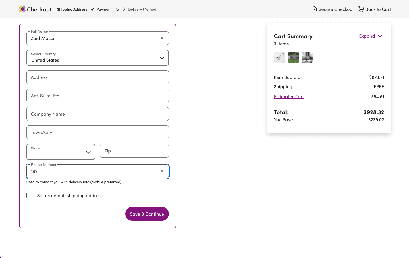
Wayfair currently presents its order summary alongside shipping and payment details, defaulting to a collapsed view that displays only the total price. Upon expansion, the summary reveals comprehensive product details.

On expansion
CHECKOUT PAGE
PROBLEM DISCOVERY
Challenges & Competitive Research
DISCOVERING CUSTOMER PAIN POINTS
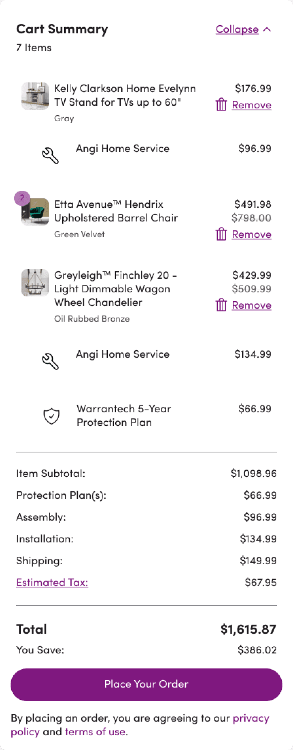
Through discovery, data analytics, and with the support of the user research team, I identified specific issues causing confusion and frustration in the customer experience
5
7
3
2
4
1
Total item count includes add-ons causing confusion
Item count readability issue
Dead/Rage clicks on Product Image Thumbnails
Non-clickable product names
Disconnect between parent product and its add-on
Confusing flow and UI of card
Lack of clarity in price breakdown
*Promo code input absent
(hidden under payment methods)
HOW WILL WE DEFINE SUCCESS?
Positive User Feedback
and Increased Satisfaction
Decrease in Checkout Exit Rates
Monitoring Order Modifications after Purchase
COMPETITIVE RESEARCH
In addition to examining best practices proven to enhance reviewing orders, I conducted an analysis of over 15 e-commerce websites, focusing on their order summaries to identify the most frequently used and noteworthy elements that worked.
What I looked for during the analysis
How were order summaries bring treated terms of visibility?
What was the extent of information shown?
What were the user actions that were allowed?
How were add-ons/services treated?
How were costs broken down?
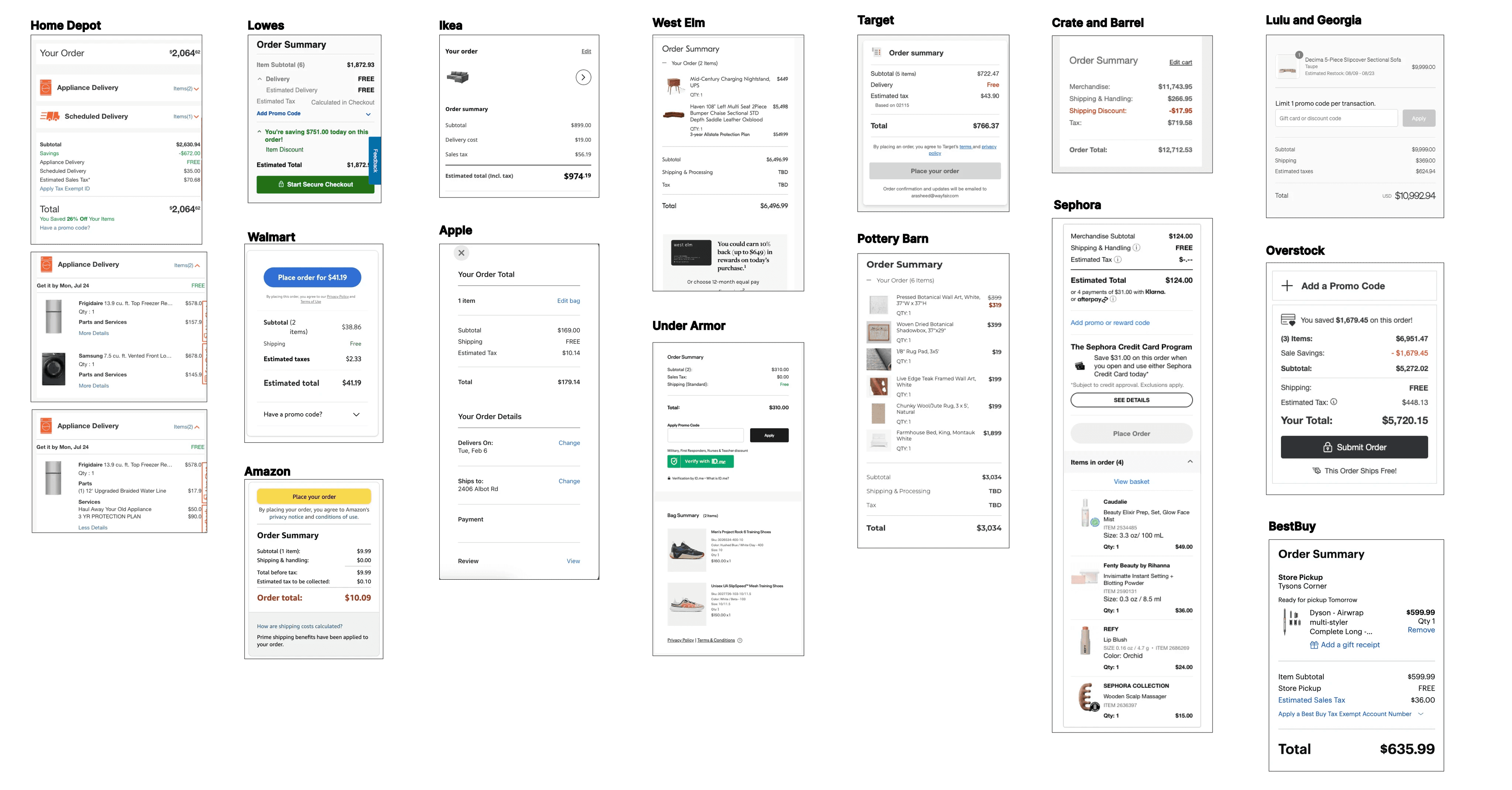
Analyzing Current Practices and Trends
Best Practices - Takeaways from Analysis and Research
2
1
3
4
5
⭐️ Order Summaries are designed to be skimmed through ⭐️
New information is not introduced at this stage of the process. (Must be disclosed in the cart).
Most websites do not provide a direct link back to the product page from checkout. This could be due to "jobs to be done in checkout vs cart."
Add-ons to a product are not considered under total item count to avoid confusion.
The ability to remove a product at checkout is divided.
7
6
8
9
10
Promo code input field in the summary will align with standard conventions and expectations.
Quantity for each product must be explicitly stated.
Add-on Services are clearly nested under the parent product.
While emphasis must be placed on the total price, there should be a breakdown available for users requiring it.
Savings highlighted for emphasis and encouragement.
PROBLEM STATEMENT
How might we optimize the order summary to ensure clarity, meet users' needs, and simplify their checkout experience?
DESIGN EXPLORATIONS
Expanding the Order Summary

Cart Summary
Cart Summary
X
Expanding Order Summary as a drawer.
Follows pattern of Cart Preview when browsing.
PROS
Larger area for product image and description
Avoids clutter on the collapsed version making it minimal
CONS
May lead user away from checkout process contributing to exit rates.
Technically harder to implement, may not be MVP
This option was ruled out based on a team decision.
Ability to preview Product details
Opens in New Window


Cart Summary

Product Details
Product details open up in a drawer
PROS
Addresses dead clicks on product names.
Allows preview without taking user away from page
CONS
Ability to view product details at the checkout stage is usually not granted according to market research.
Any updates to product (size, color, etc) through the drawer would require backend integration.
⚠️ This option needed more discovery and impact study from PM and Dev – Shelved for next quarter.
Collapsed State
🧠 Reducing Cognitive Load
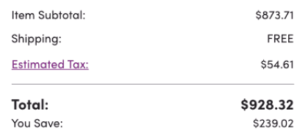
EXISTING
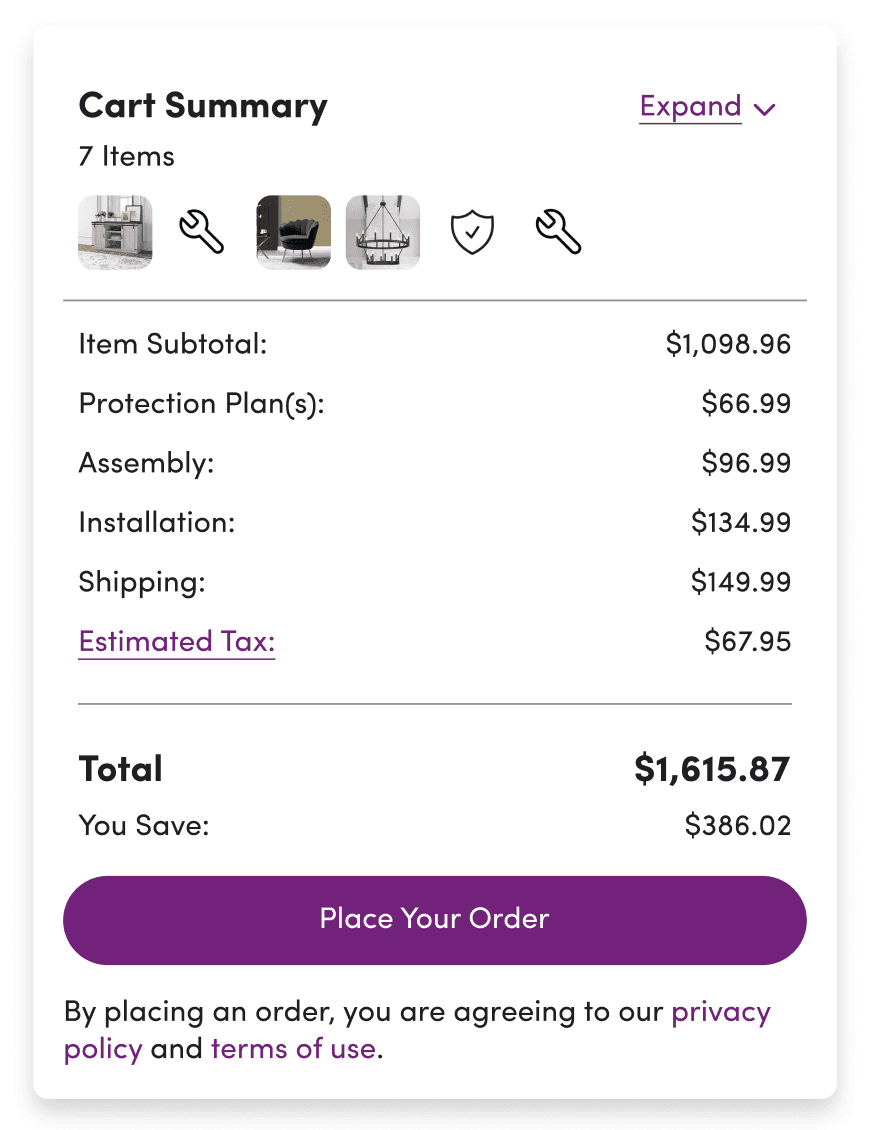
Maximum of 6 product icons displayed
EXPLORATION
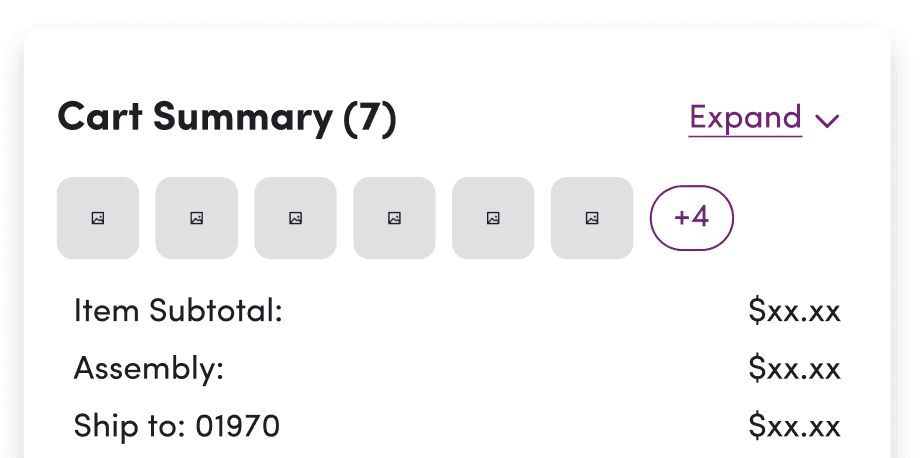
Add maximum number of icons and indicate more with “+1,+2...”
Move item count to title for clarity
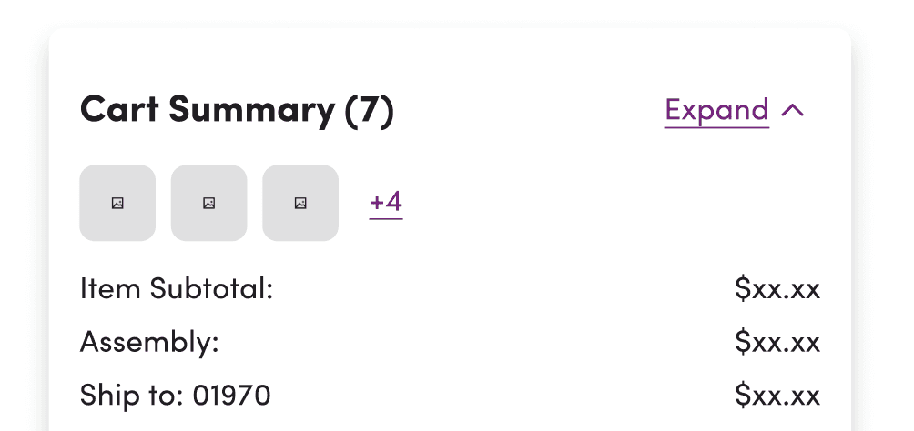
Limit icons to 3
Indicate more products with “+1, +2...” variation

Eliminate product icons to reduce distraction
Change “Cart” to “Order Summary” to reflect conventional naming standard
READ MORE: Design Explorations
HYPOTHESIS
If we prioritize essential information, offer clarity and minimize distractions through progressive disclosure in the order summary, then users will feel more confident in placing their orders, avoiding confusion and the need to revisit their carts.
USABILITY TESTING
To test my designs, I created a research plan to evaluate how users were engaging with the redesigned Order Summary in comparison to the current experience. I received approval from the user research team and carried out a balanced comparison A/B test on Usertesting.com.
GOALS
What are users looking to do?
Impressions on product listing
How do they engage?
SCENARIO
You've selected products and services on Wayfair.com and added them to your Cart. You've filled in all your payment and shipping details. Now, you're ready to complete your purchase.
TASKS
How would you use this order summary as part of your shopping process? What are your initial impressions of it?
Where would you expect to click to see more information?
Which pieces of information are the most and least useful?
If there was one thing you could change about this section, what would it be?
On a scale of 1-5, how helpful did you find the information in this section to make you feel confident in checking out?
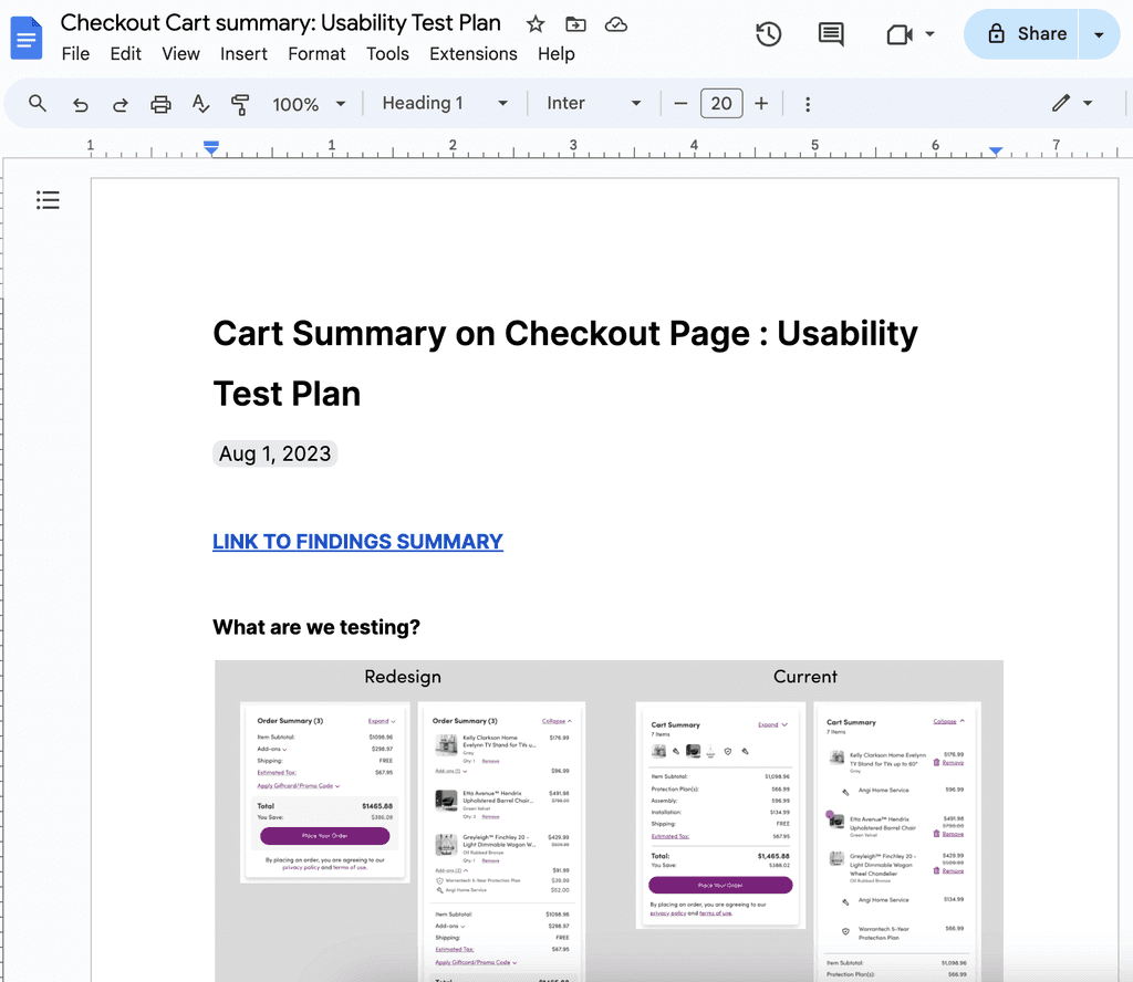
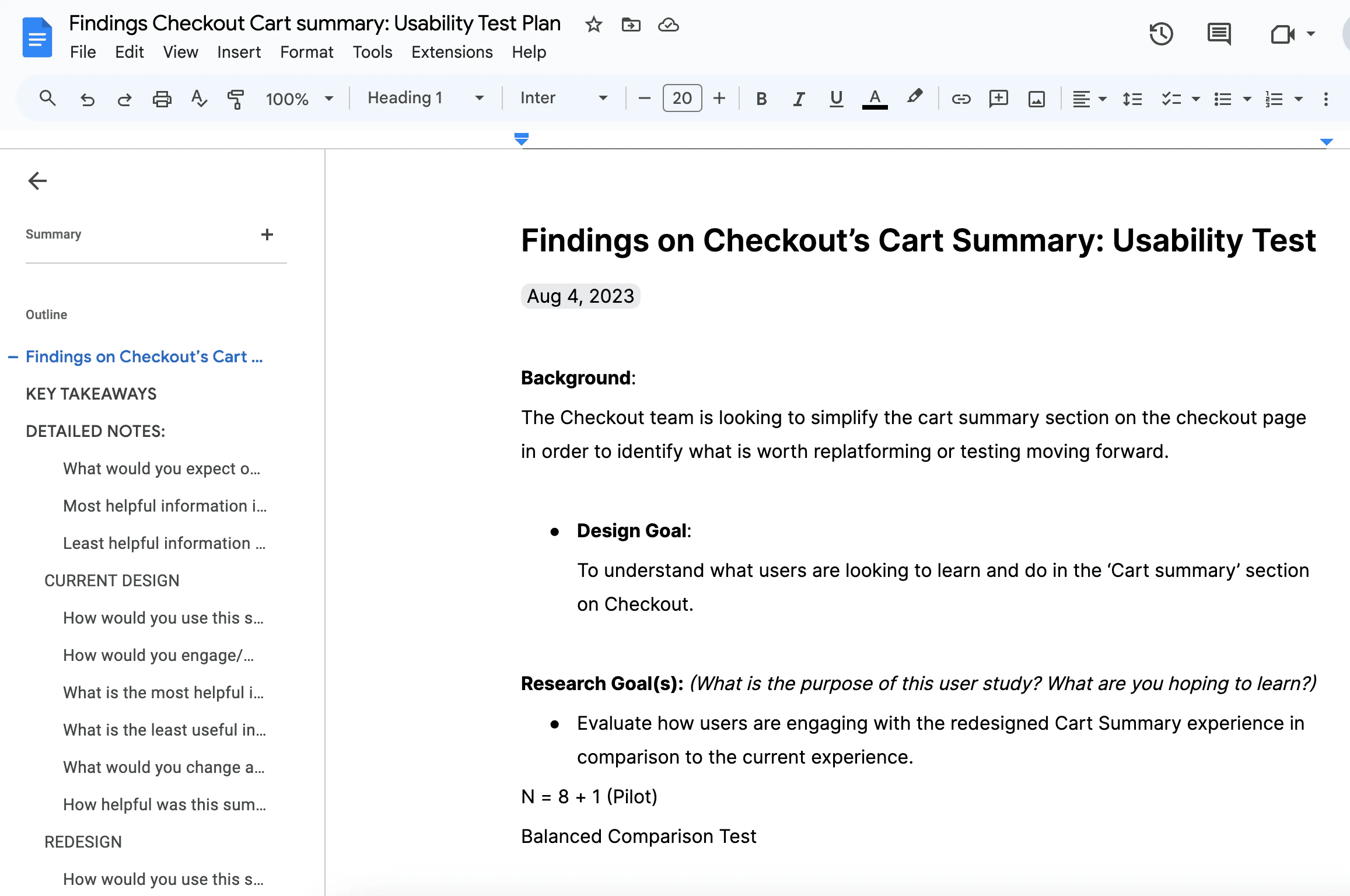
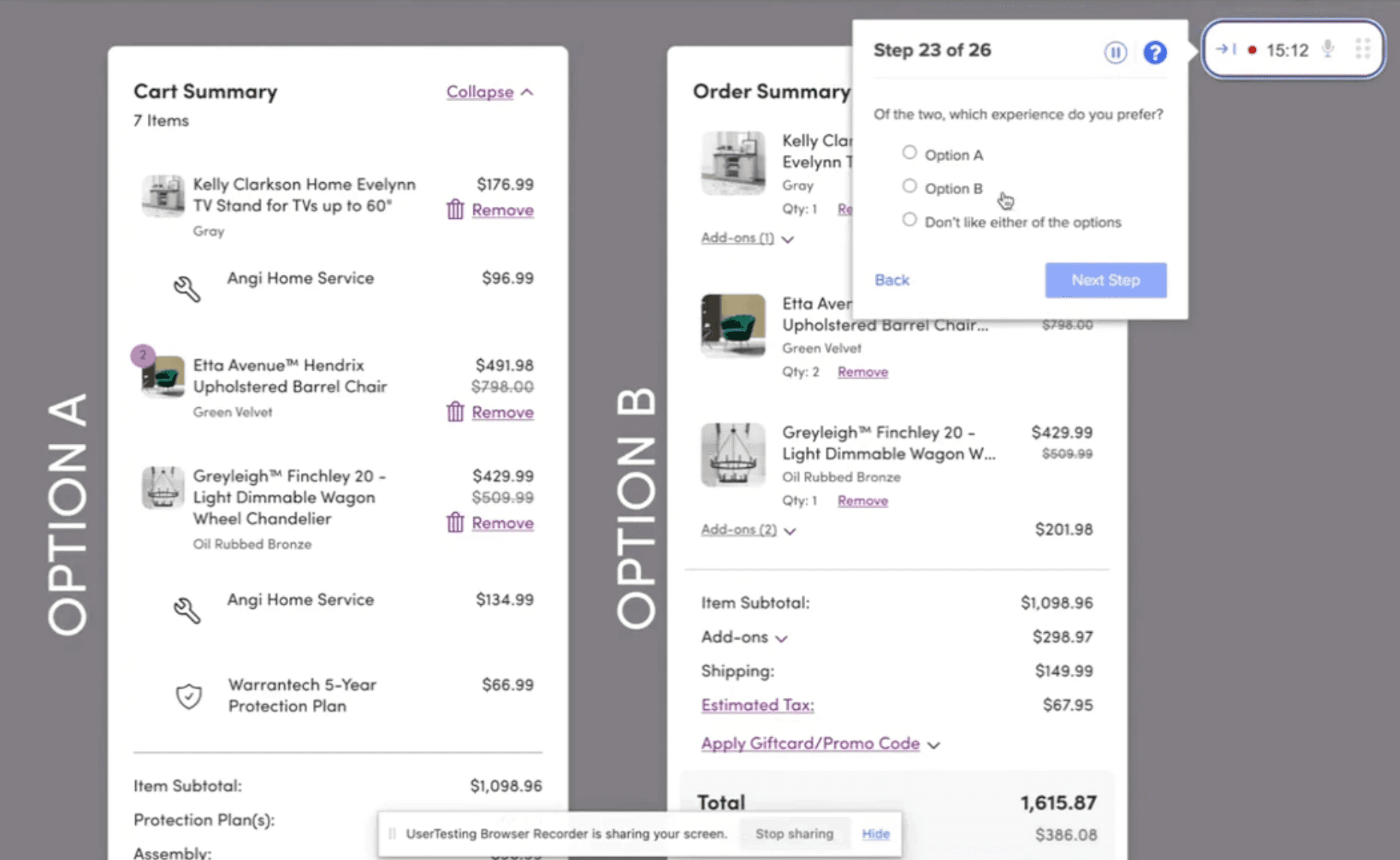
Glimpses of the Research Plan and Testing
Preview of the prototype we tested
8/9 participants expressed increased confidence in placing their orders after reviewing the redesign compared to the existing version.
What users preferred in the A/B testing
Current (1)
Redesign (8)
READ MORE: Highlights & Takeaways of User Test
IN SUMMARY
An order summary serves as a quick-check point for users to review their purchases. Unlike the cart, users value clarity and prefer additional information to reveal itself (on expansion) only if absolutely necessary.
The following were what users found most useful in the summary:
Price
Product Name and Image
Quantity
Add-on Services Cost Breakdown
Add-on Services Grouping
Removing Items
DESIGN OUTCOME
(Presented to the Lower Funnel Team with Further Recommendations)
EXISTING

PROPOSED

Title and Item Total
Product Card UI + Quantity
Service Add-ons cost grouping
Highlighting total cost & savings
Services under parent product
IMPACT AND NEXT STEPS
An improved order summary experience would positively impact the overall efficiency and user satisfaction of the checkout process while aligning with:
Smoother checkout transactions
Reduced exit rates
Decreased instances of order modifications
With room for development and testing, certain elements required further exploration and input from stakeholders. I compiled my findings and discussed areas that could benefit from additional exploration and enhanced clarity with my team.
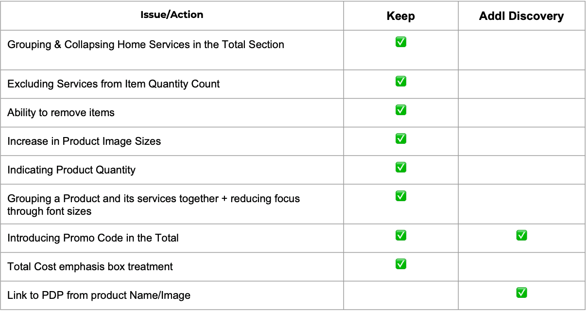
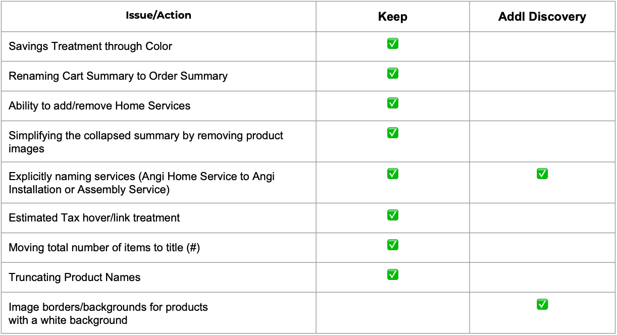
Glimpse of Next Steps and Recommendations
FEEDBACK
"Abby consistently places the user's needs at the forefront of her designs, investing time to comprehend insights that ensure her creations are not only visually appealing but also intuitive, and purpose-driven. This resulted in a winning user tested redesign."
Devika Gupta
Lead Product Designer, Wayfair
REFLECTION
My Biggest
Challenge
Striking a balance between business value and user needs. I invested time in engaging with the Product Team to understand business decisions shaping the Checkout page. Through prioritizing user advocacy, I deepened my understanding of the product and business strategy integral to the Cart and Checkout processes in an e-commerce website.
A Key Learning
Understanding the multiple ownerships for features on a single page and finding ways to get them all to align to a single strategy. I developed effective communication strategies to collaborate, offer recommendations, seek advice on design work, and address current user pain points across diverse teams including product, design system, financial and content writing.
With More Time
I Would
Dive even deeper into the groundwork laid by past research and testing on the feature conducted years ago. Also, exploring additional edge cases could bring valuable insights and improvements to the implementation.