EASTERN MARKET
Rebranding a local farmer's market
Role
Visual Designer |
Course Project
Time
5 weeks
Feb-March 2023
Tools
Figma
Photoshop
Deliverables
Desktop and mobile website redesigns

OVERVIEW
What is Eastern Market?
Eastern Market is located in the Capitol Hill neighborhood of Washington, D.C since 1873, and has been a central hub of commerce, offering visitors a diverse range of fresh produce, meats, dairy products, baked goods, and artisanal crafts. Their website offers a directory of vendors, market hours, and information on upcoming events.
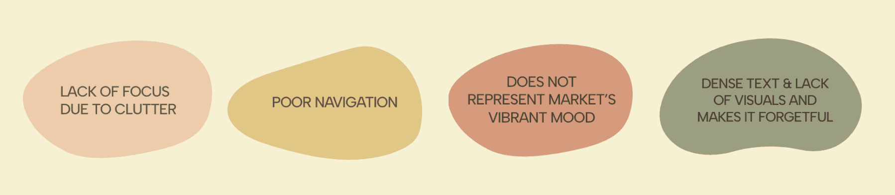
PROBLEM
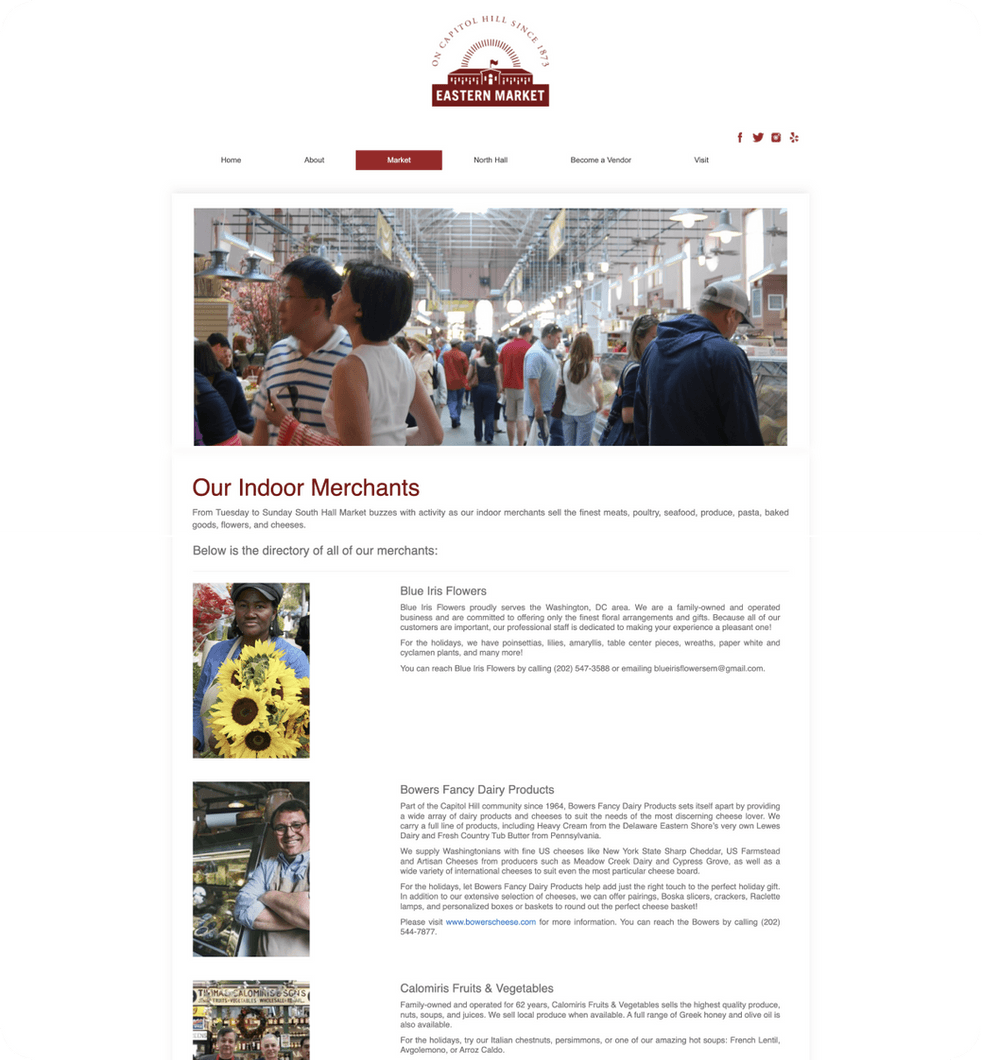
The current visual design of the Eastern Market website presents usability issues for visitors due to an outdated design, inconsistent visual hierarchy, poor navigation, and cluttered layout, leading to difficulty in finding important information.
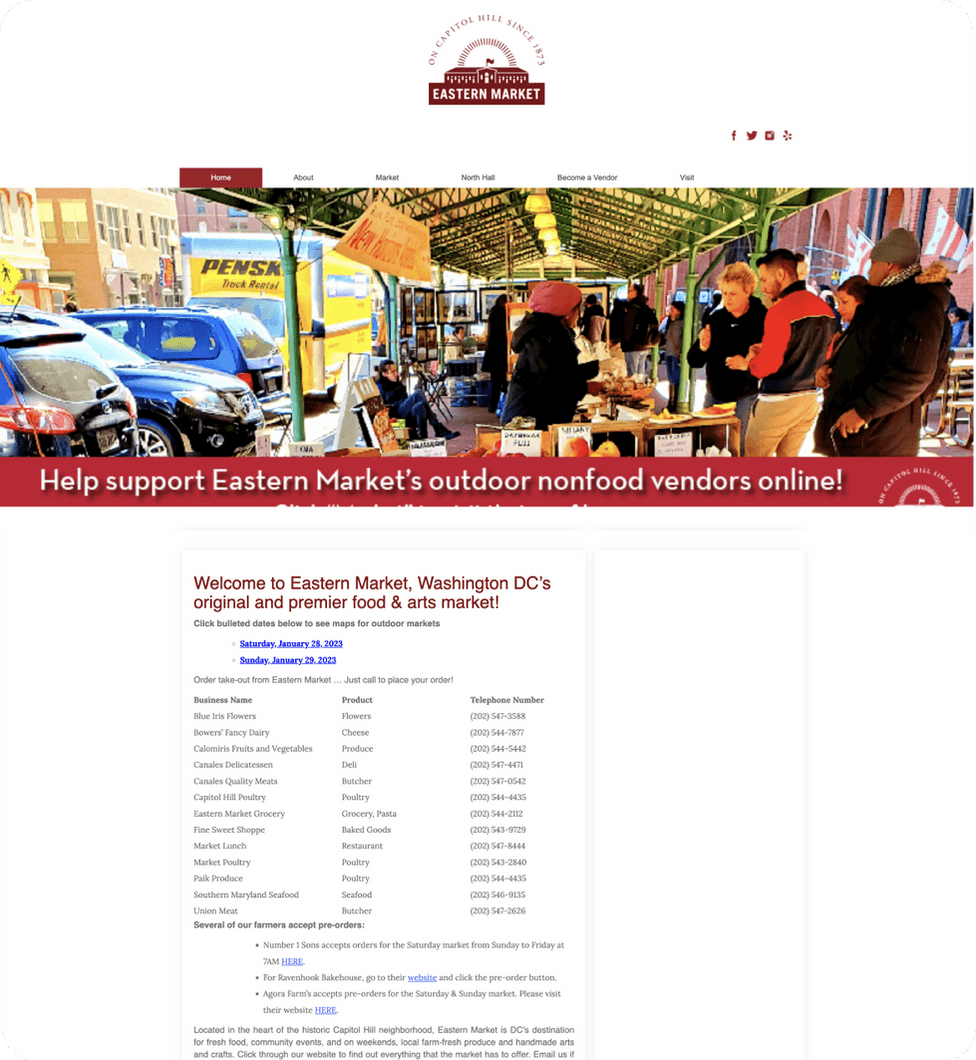
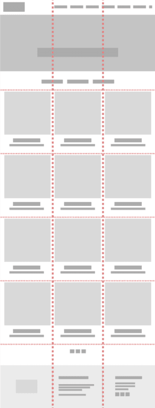
Existing Home Page
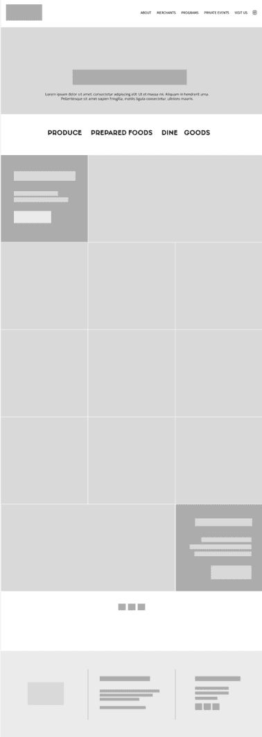
Existing Merchants Page
CONTEXT
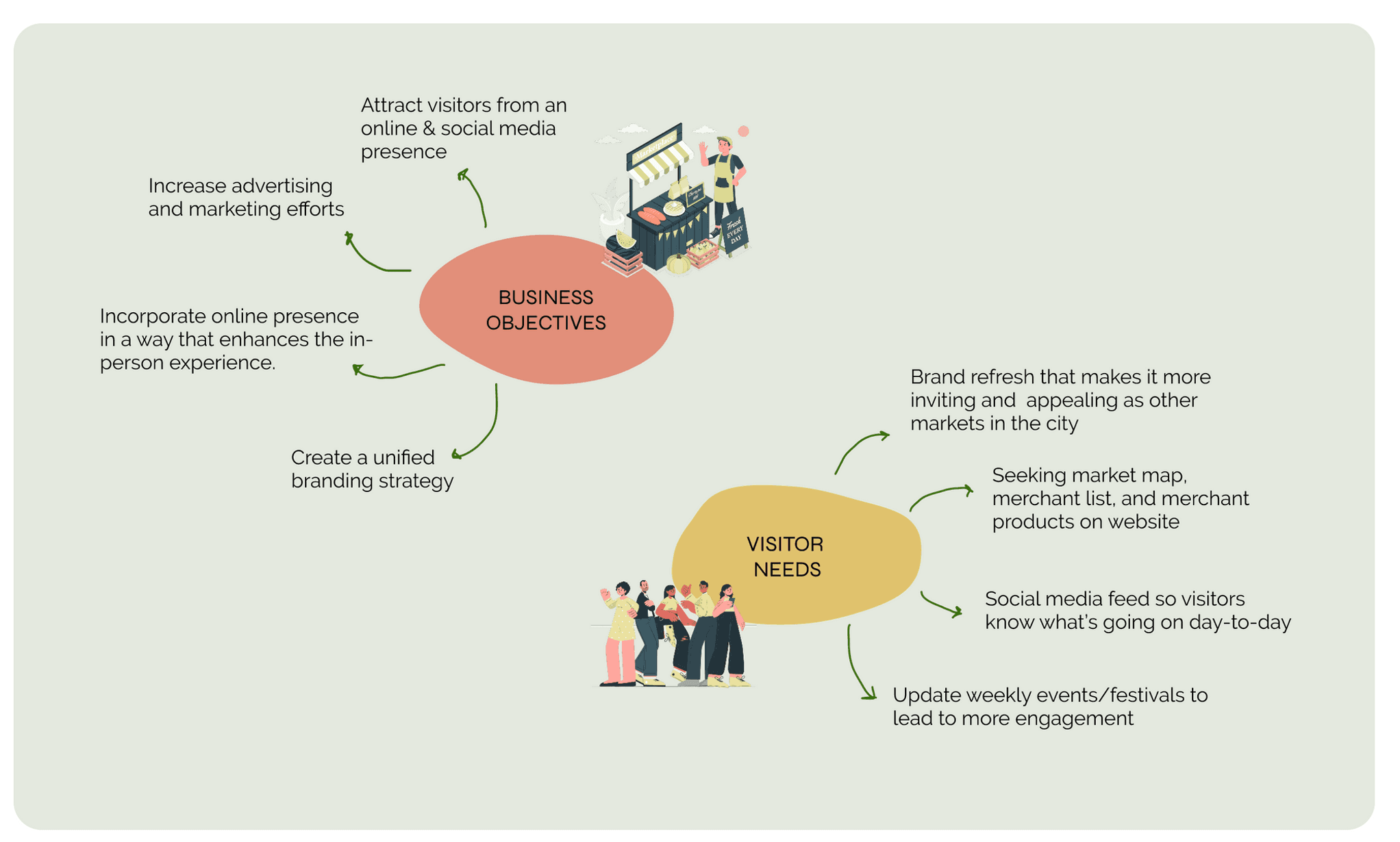
I conducted a research study into the history and current state of the market to understand how its business objectives and visitor needs have evolved.
POTENTIAL
Over 300,000 visitors at the physical location annually
USER GROUPS
Local shoppers 40%
Tourists 60%
Over 50% visitors were below 45 years of age
WHY DO THEY VISIT?
A significant number of people come
“for the experience”
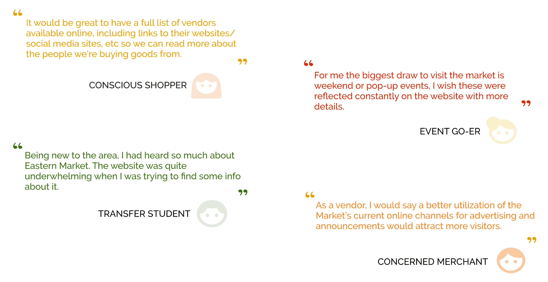
What Do Visitors Think?
After conducting informal interviews about the brand’s online presence, most visitors agreed that there was a need to coordinate and expand marketing, particularly to people beyond the neighborhood and those visiting the city.
What We Are Solving
Who Will We Design For?
ENGAGED ETHAN

“You can’t buy engagement, you have to build it.”
Keeps track of trending places, products and events depending on how brands market themselves.
Wants brands to stay updated with the times and have a “visible” online presence.
SLOW TRAVELER KATIE
“I like supporting communities by shopping local”.
Wants markets to have a go-to source that can help plan her visit.
As a conscious traveler, wants to have access to a vendor directory and their product information so she can plan who she wants to visit.
VISION
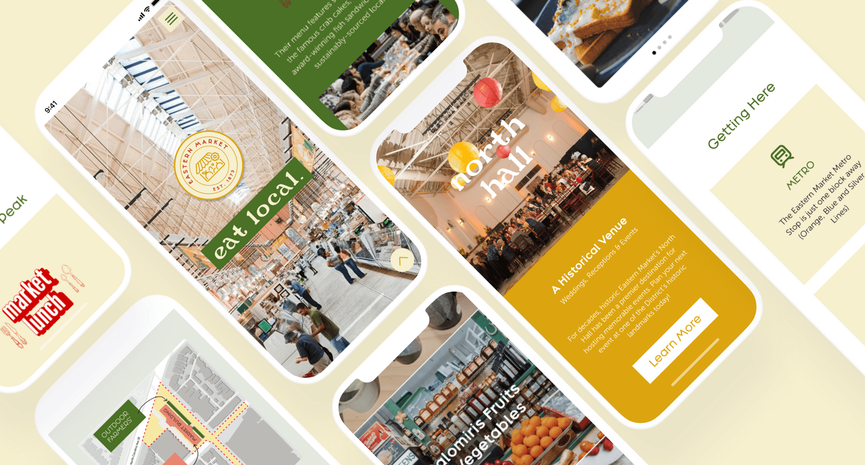
"Rebranding the website of the Eastern Market in D.C. to help enhance its visual appeal and user experience, while also reflecting the energy and vibrancy of the market."
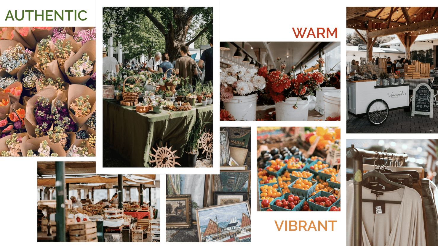
Rebranding the website to convey a more vibrant and energetic mood.
A simple and intuitive navigation to help visitors find what they need quickly and easily.
Prioritizing a clear and consistent visual hierarchy using appropriate visual design principles.
Personalized vendor pages featuring their personal story and unique offerings.
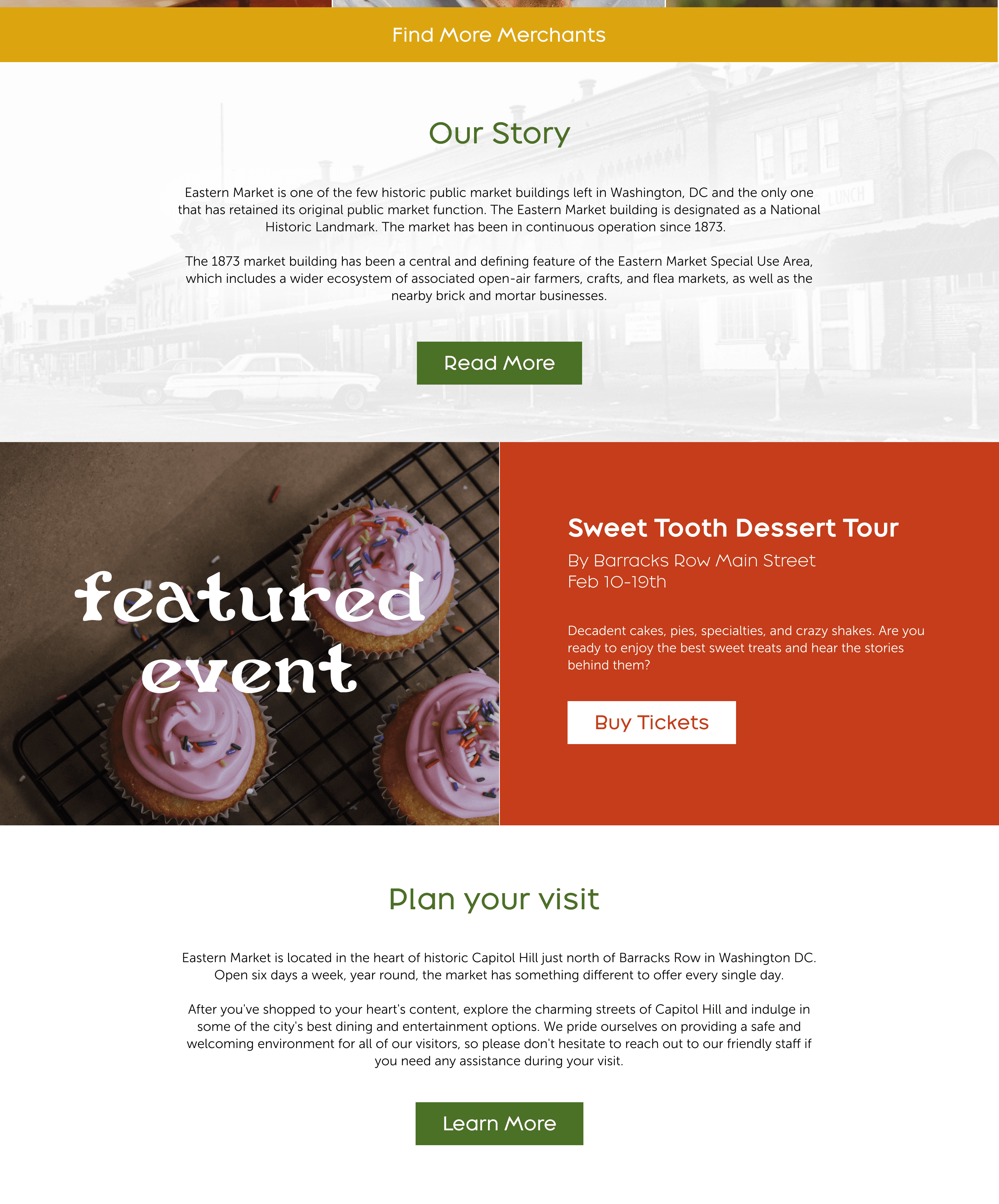
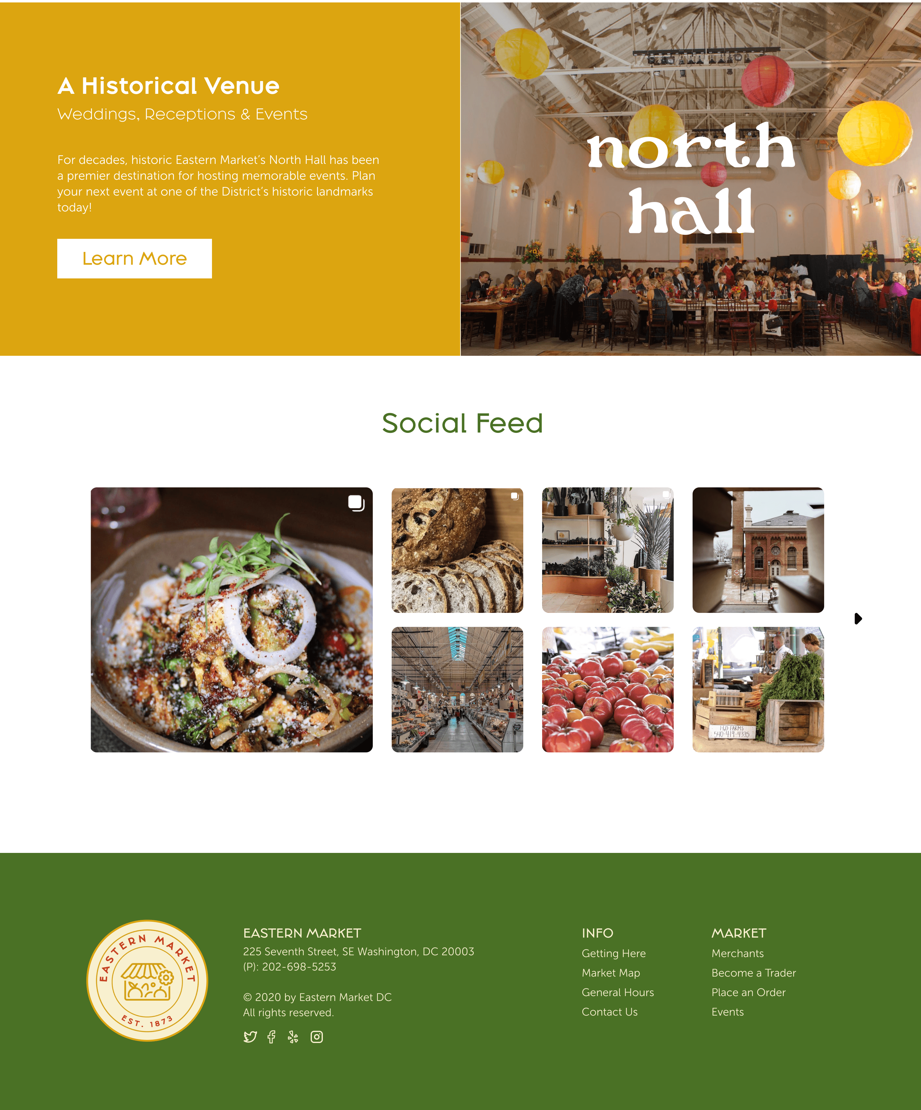
Creating a strong visual impact through high-quality images of the market and its products.
Add daily/weekly updates to showcase latest events and social media feed.
IDEATION
Colors
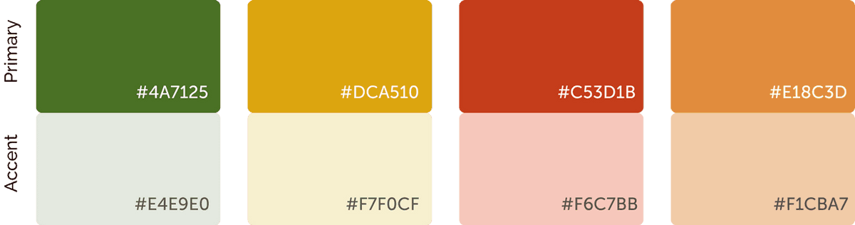
Color plays an important role in creating the visual mood of a farmers market. Bright, vibrant colors such as red, orange, and yellow are often used to represent the fresh and wholesome nature of the market's offerings. These colors are typically complemented by natural greens which help to create a sense of harmony and balance.
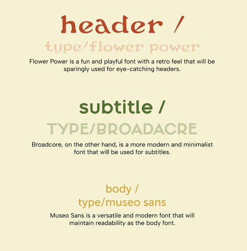
Typography
The current visual design of the Eastern Market website presents usability issues for visitors due to an outdated design, inconsistent visual hierarchy, poor navigation, and cluttered layout, leading to difficulty in finding important information.
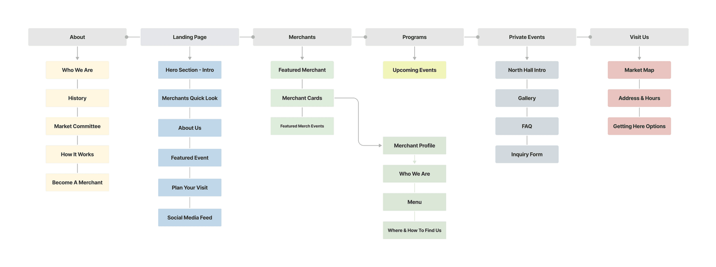
INFORMATION ARCHITECTURE
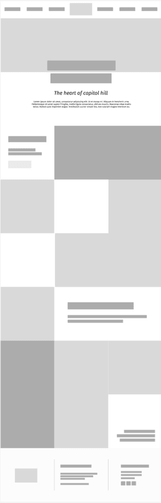
WIREFRAMES
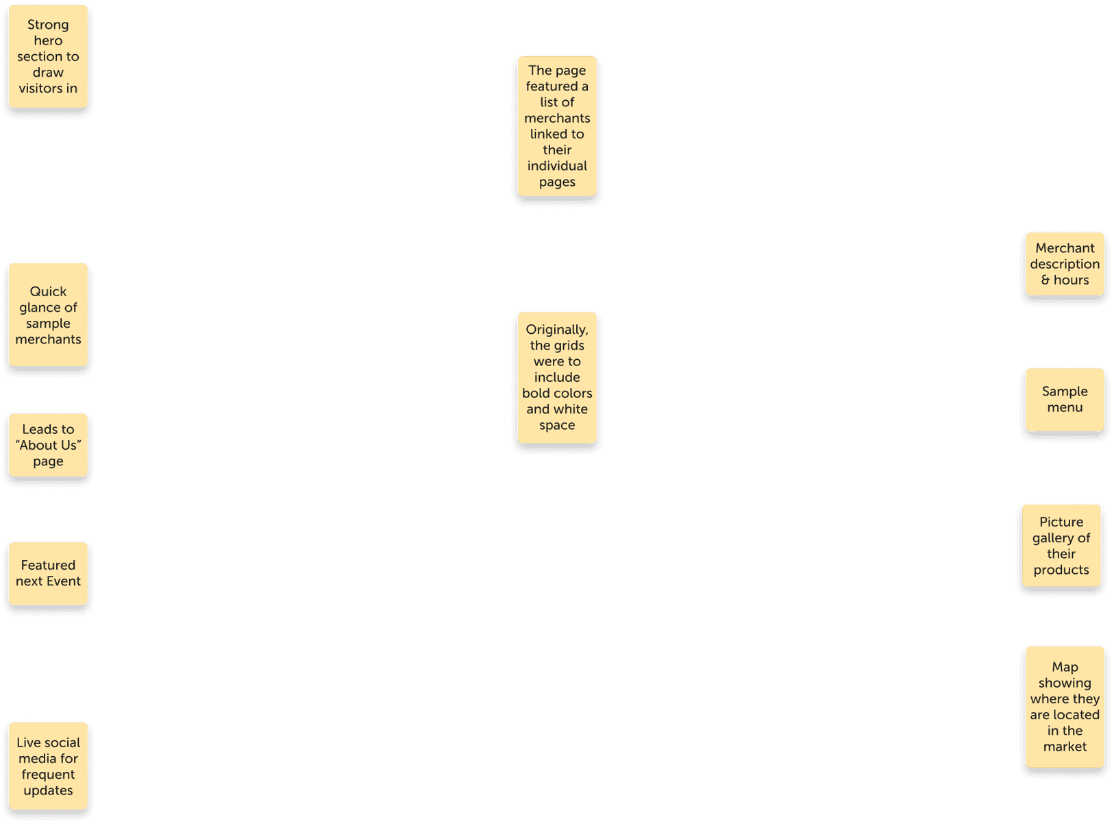
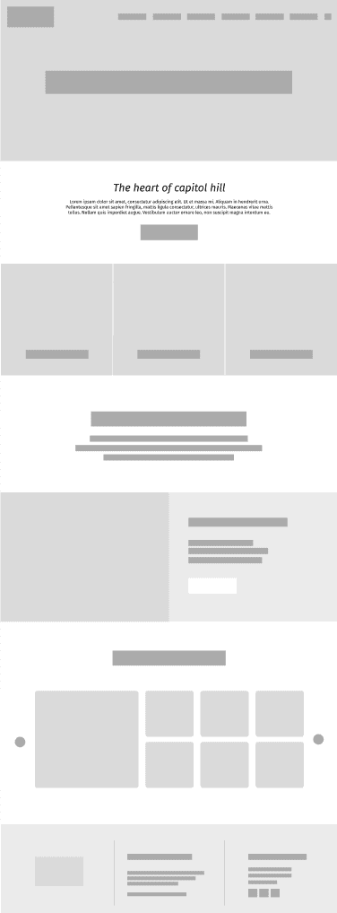
The homepage displays a comprehensive view of the market’s offerings designed for easy navigation.
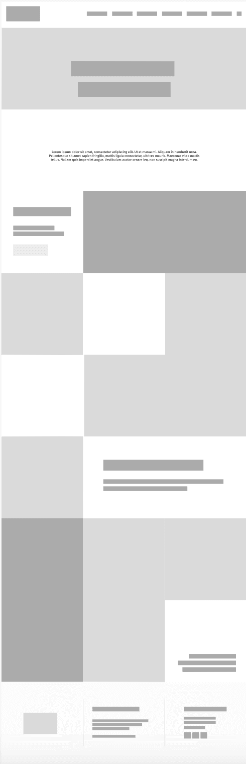
Grid layout with some squares spanning 2 rows or columns. It’s organized for clarity and discovery while also using filters to sort them out by category

Initial approach: How can each merchant page stand out? Maybe incorporate their character through specific type/color/background pattern?
PROCESS
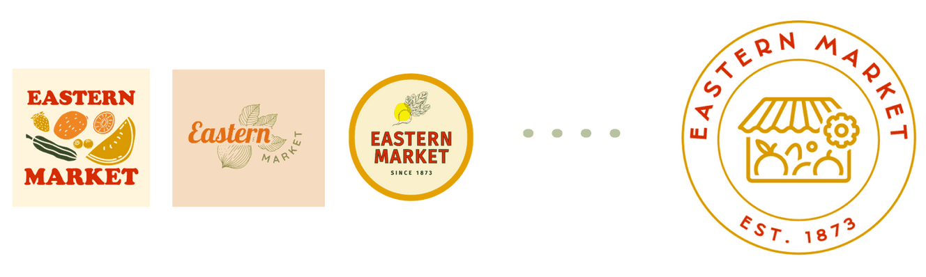
Logo Designs
Layout changes for Merchants page
The first grid seemed very safe and straightforward. The layout risked being boring or lacking in personality.
The second iteration was a play- each image spanned beyond its original grid including vertical and horizontal orientations. This appeared very busy and overwhelming with images.
The final iteration had the featured merchants/ merchant events highlighted at only the top and bottom row. This was cleaner and easier to look through.
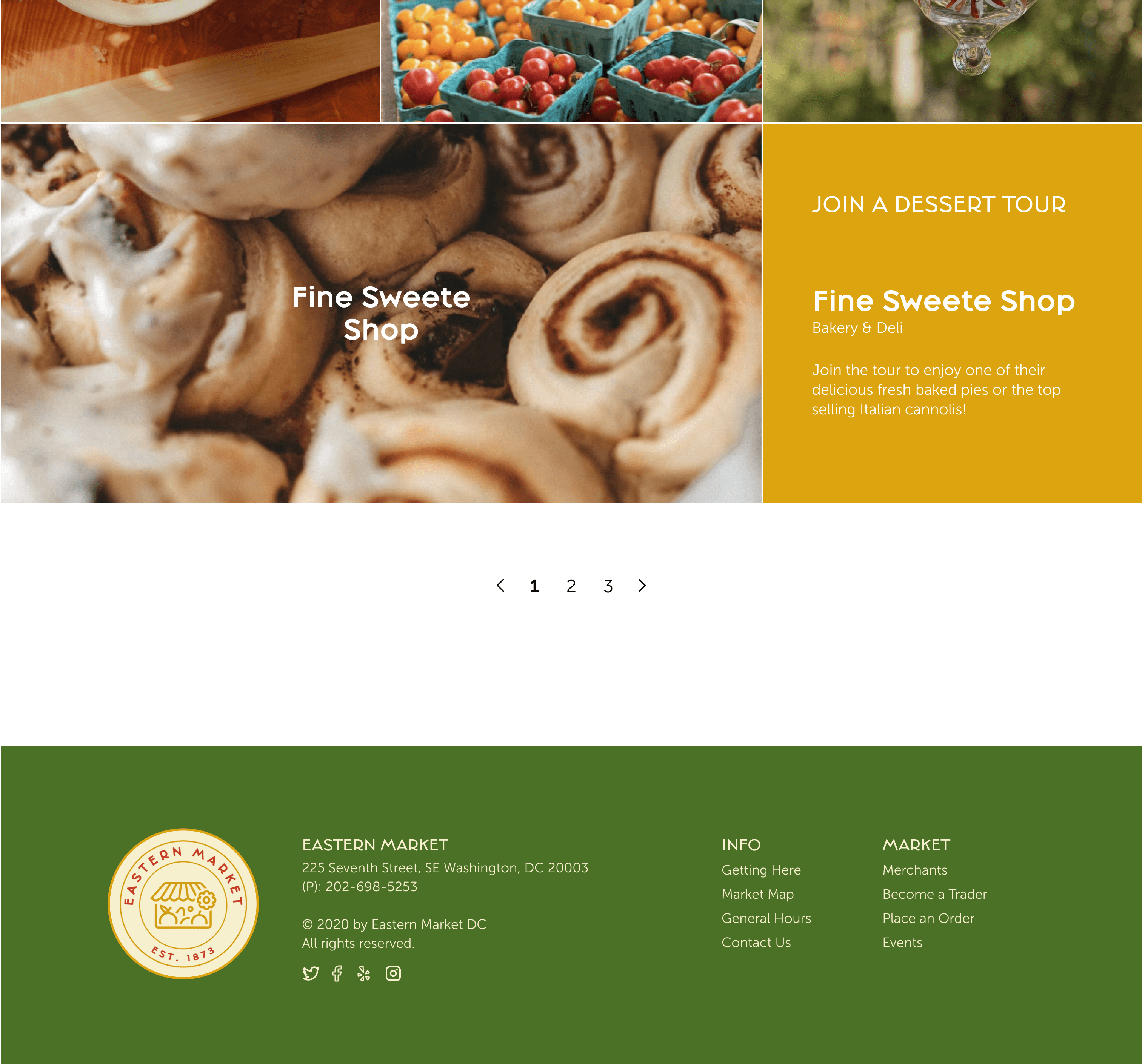
Card filters for product categories
The filters can be used if they’re looking for a particular category. I choose to have pages over infinite scroll to let visitors discover vendors mindfully over an endless scroll without motive.
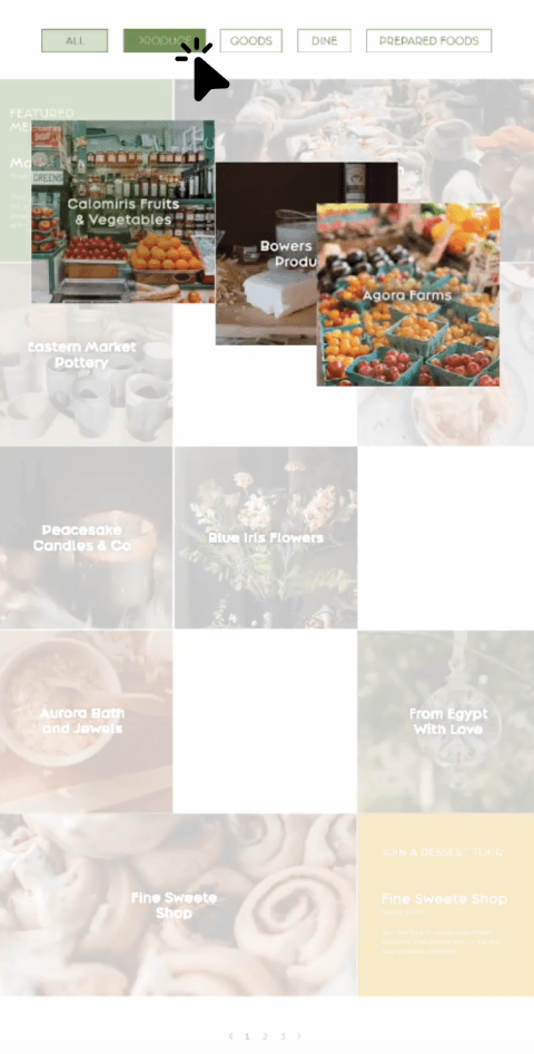
Merchant Cards / Hover States
Initially, the hover states were designed with icons of similar styles. Through feedback, I recognized that they did not add to the personality nor contribute towards vendor recognition.
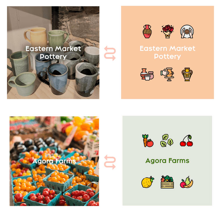
I created logos for some of the merchant stores that appear over their card’s hover state. It includes a caption stating sample products they sell

Design Elements
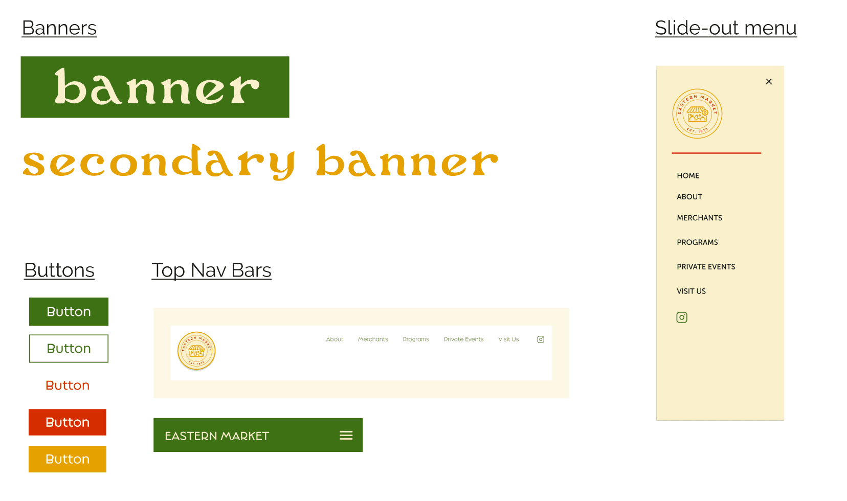
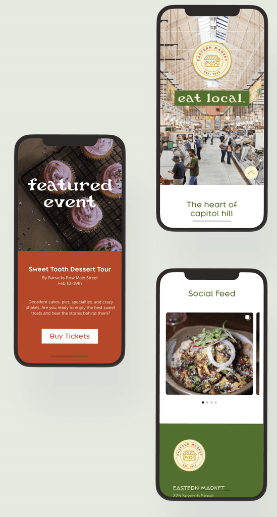
DESIGN
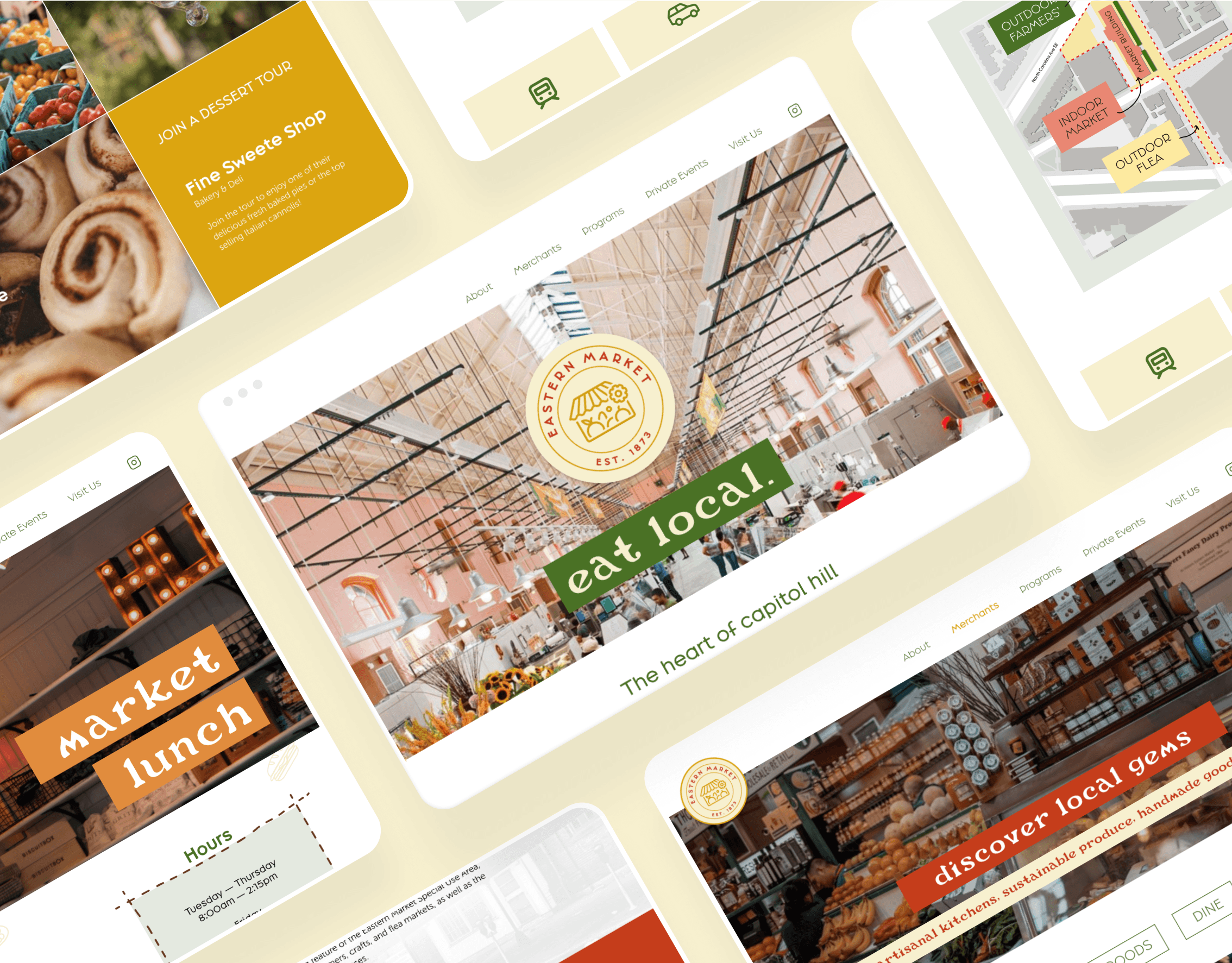
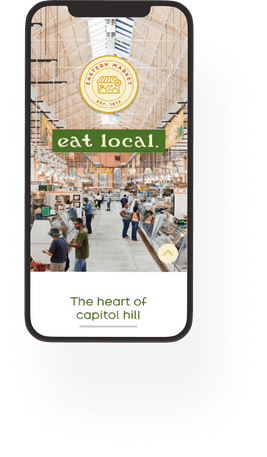
HOME PAGE
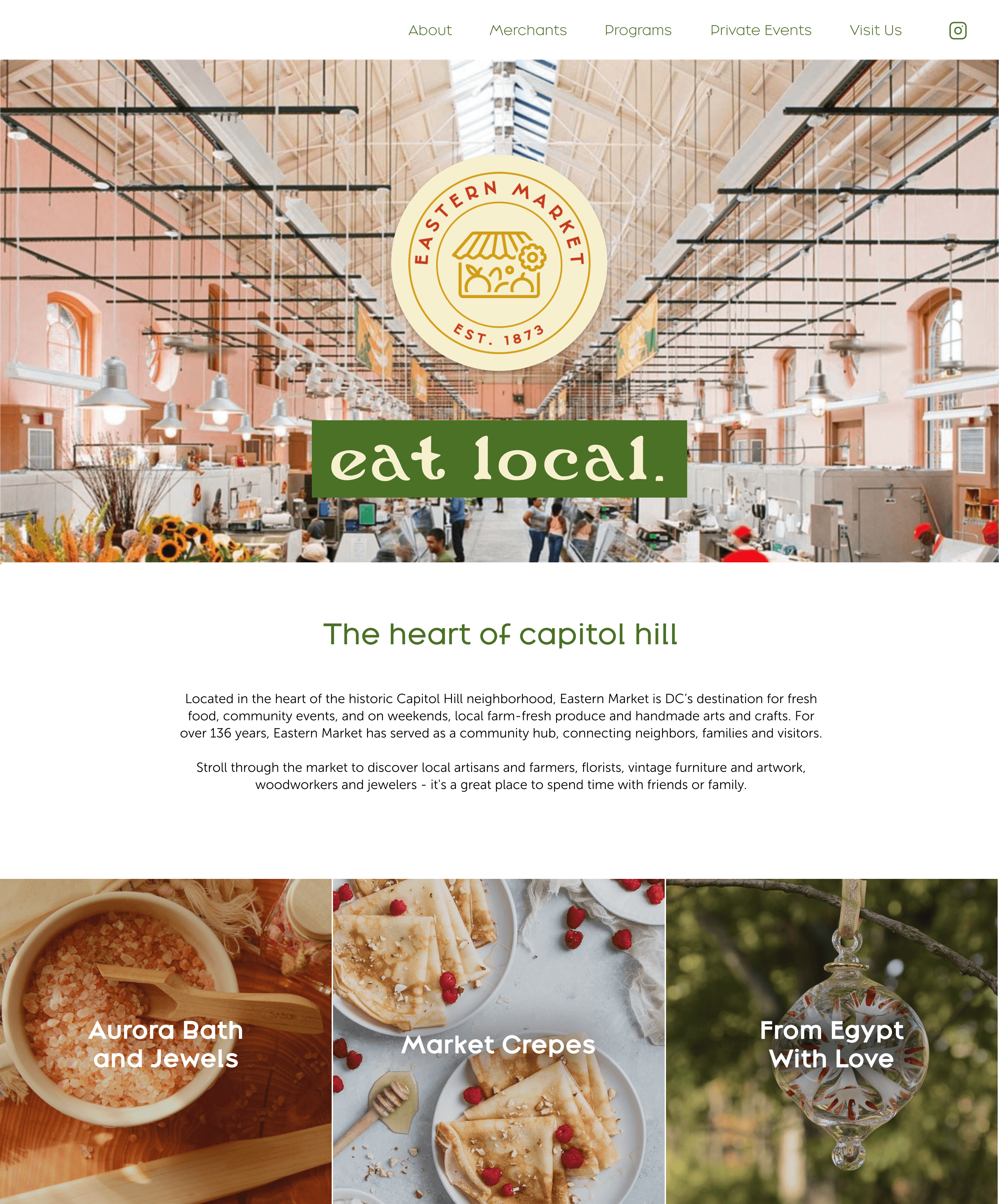
merchant
PAGE

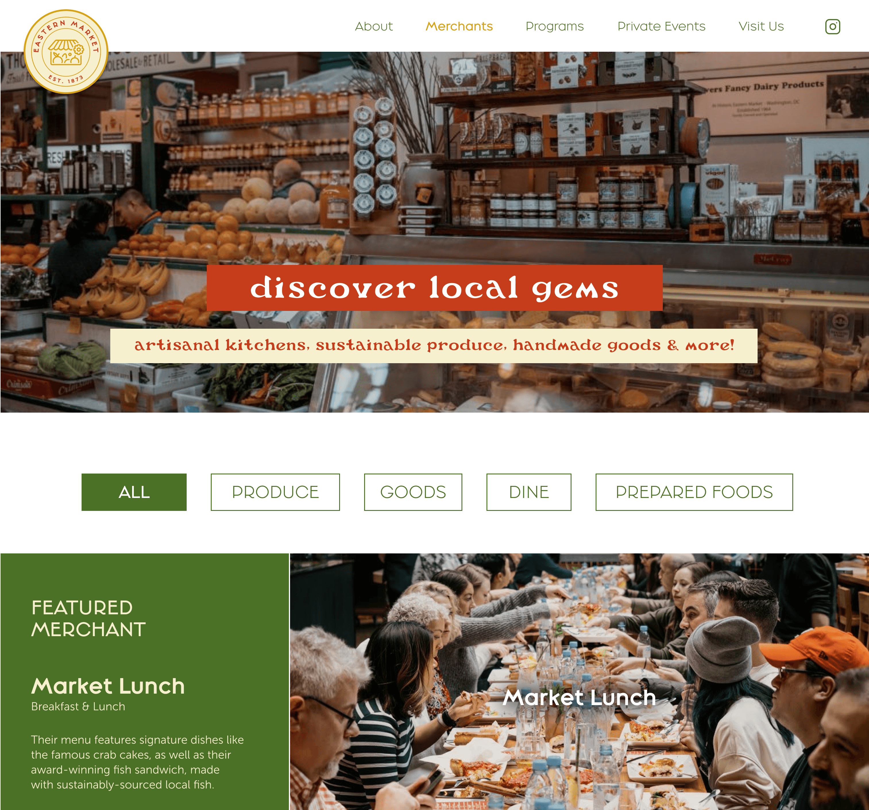

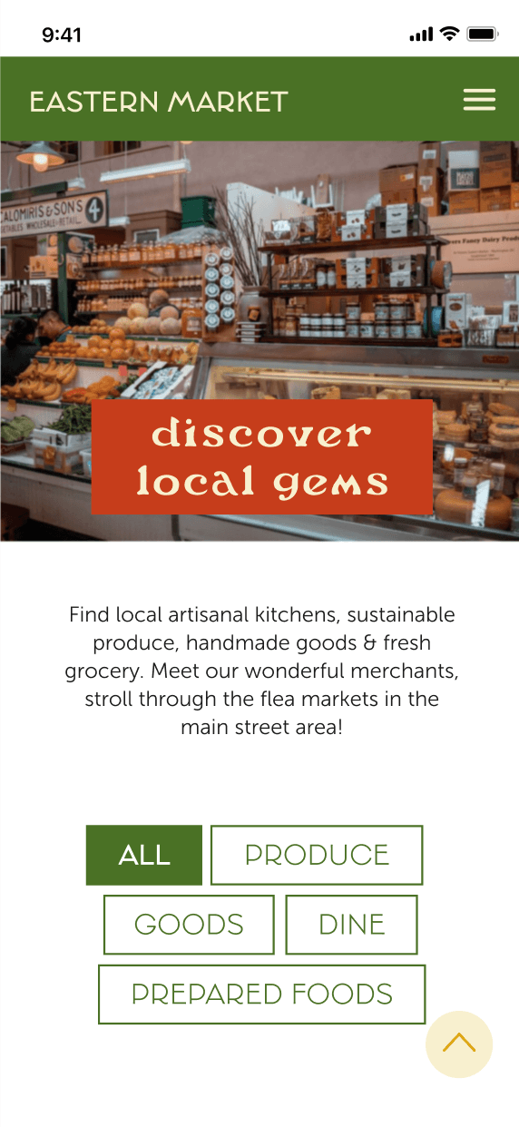
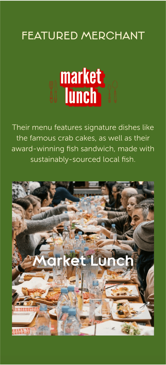
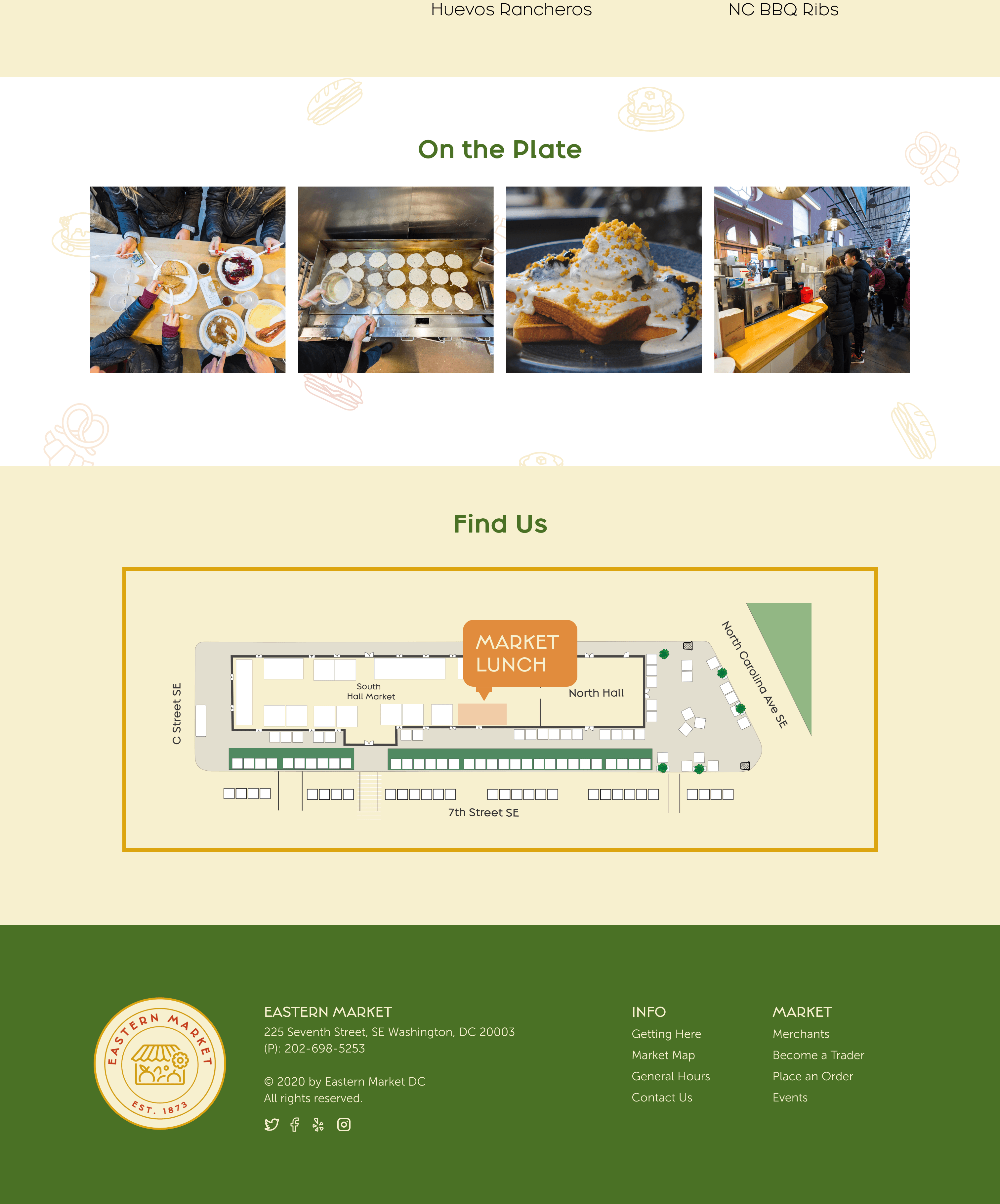
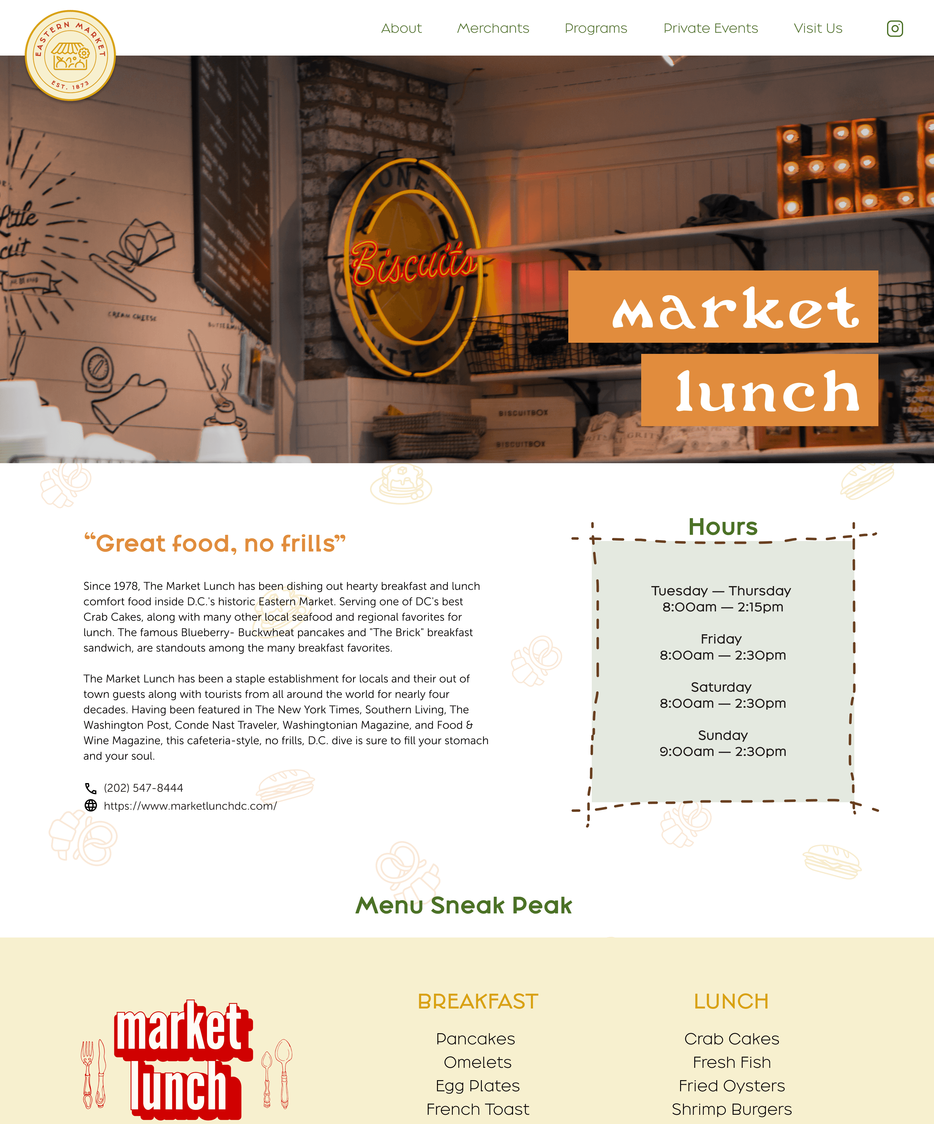
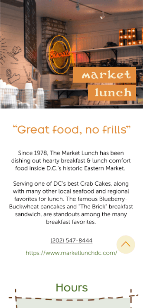
MERCHANT
PROFILE
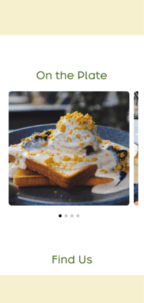
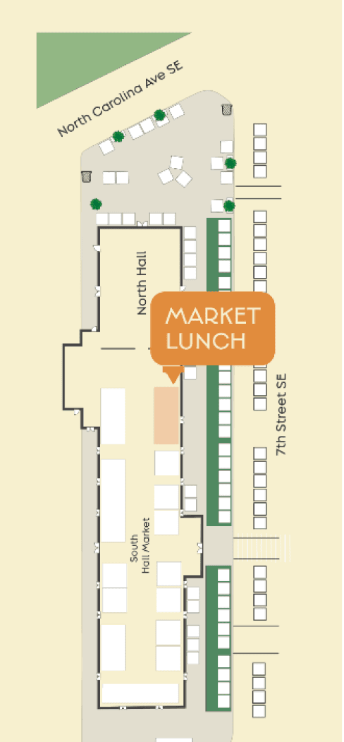
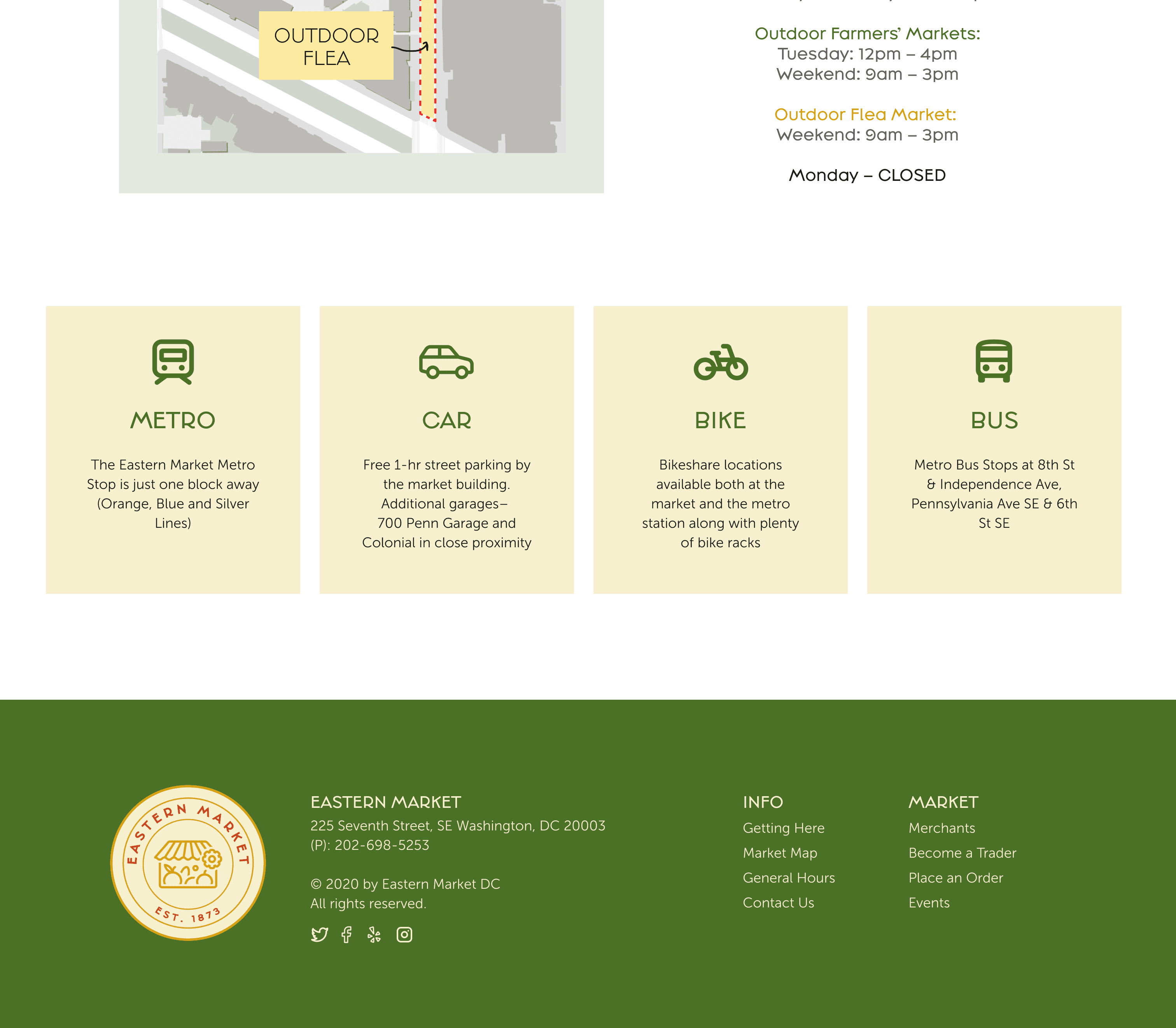
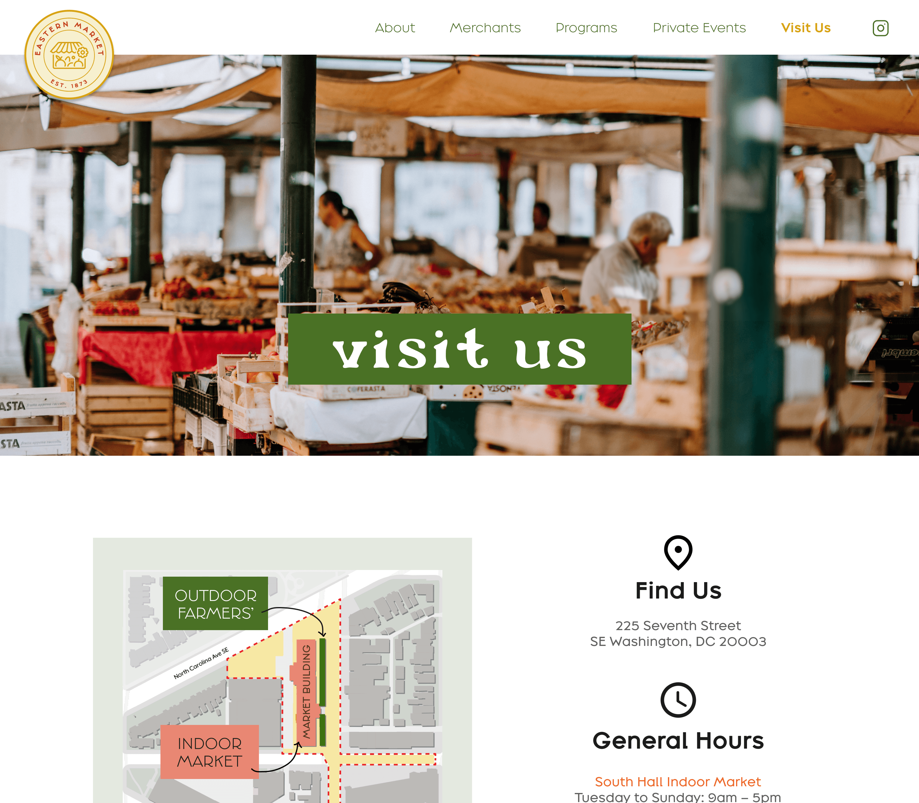
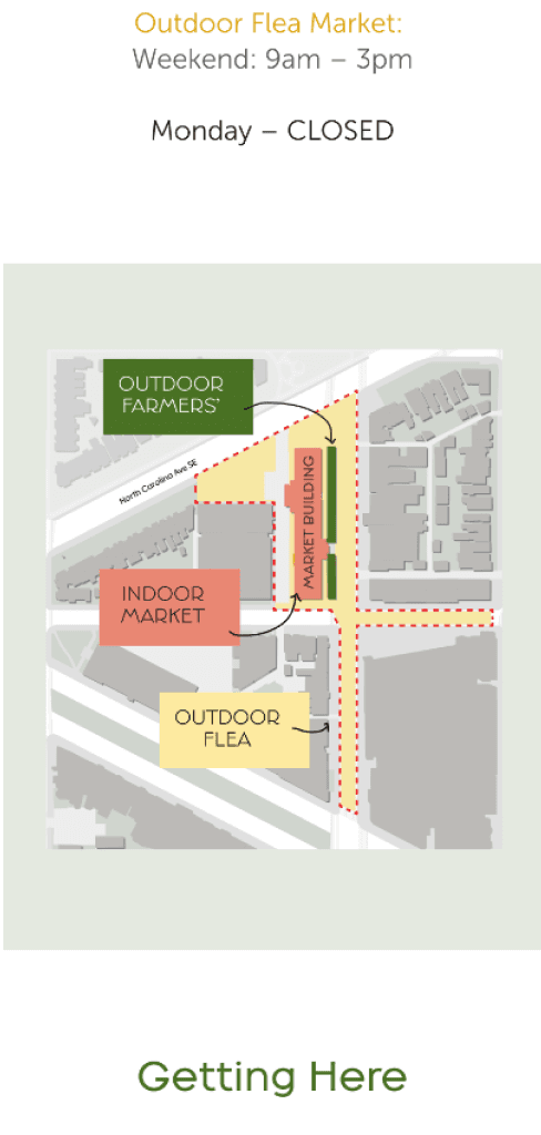
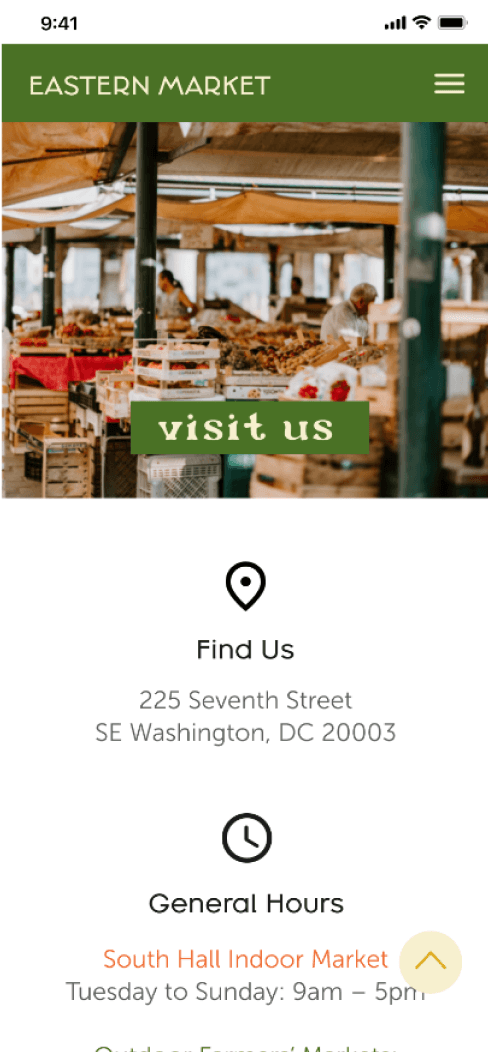
VISIT US
INTERACTIVE PROTOTYPE
Click through below to see how it works!
REFLECTION
Redesigning the Eastern Market website helped with:
Reinforcing the importance of knowing and understanding brand identity and its values to me. It was essential to consider the brand's personality and ensure that the new design reflects it accurately. With the vibrant style evoking a sense of energy and excitement, understanding it helped me align it with the lively atmosphere of the Eastern Market.
To create an immersive and memorable experience for the user, it was important to focus on user engagement and overall user experience. By utilizing bold colors, playful typography, and eye-catching graphics with interactive elements, I recognized that it could encourage users to explore the content further.
Achieving the right balance between aesthetics and functionality required multiple iterations of the design and considering all its aspects. If I were to extend these designs to additional pages, I would focus on creating unique merchant profiles and ensuring that each one had its own personality incorporated into the visual style.